
CredAble • B2B FINTECH • 2025
Borrower onboarding redesign


TIMELINE
8 Weeks
8 Weeks
PLATFORM
Desktop, Mobile, BAAS
Desktop, Mobile, BAAS
TEAM
Design Manager (me)
2 Product Managers
1 Developer
Design Manager (me)
2 Product Managers
1 Developer
Summary
We redesigned CredAble's borrower onboarding to reduce friction across a complex loan application journey. As Design Lead, I worked with Product and Engineering to make the process faster, simpler, and easier to trust, so more borrowers could complete their application without giving up partway through.
We redesigned CredAble's borrower onboarding to reduce friction across a complex loan application journey. As Design Lead, I worked with Product and Engineering to make the process faster, simpler, and easier to trust, so more borrowers could complete their application without giving up partway through.
Result: ~40% faster completion, from ~20-25 minutes to ~12-15 minutes.
Result: ~40% faster completion, from ~20-25 minutes to ~12-15 minutes.
PROBLEM
Borrowers were doing too much thinking
Applying for a business loan already asks a lot of the user. The existing product was asking for more effort than the task required.
Four things stood out:
Applying for a business loan already asks a lot of the user. The existing product was asking for more effort than the task required.
Four things stood out:
The stepper over-explained itself.
The stepper over-explained itself.
Every upcoming step showed full detail before it was relevant, making the journey look longer than it was.
Every upcoming step showed full detail before it was relevant, making the journey look longer than it was.
GST verification broke the flow.
GST verification broke the flow.
Users had to leave the product, authenticate on the government GST portal, and find their way back — guided by text instructions alone.
Users had to leave the product, authenticate on the government GST portal, and find their way back — guided by text instructions alone.
The loan offer buried its own key facts.
The loan offer buried its own key facts.
The Key Fact Sheet and Repayment Calculator lived in separate pop-ups, at the exact moment users needed them most visible.
The Key Fact Sheet and Repayment Calculator lived in separate pop-ups, at the exact moment users needed them most visible.
The layout couldn't flex across partner brands.
The layout couldn't flex across partner brands.
CredAble ships this journey white-labeled; the design had to absorb different colors, logos, and imagery without a rebuild each time.
CredAble ships this journey white-labeled; the design had to absorb different colors, logos, and imagery without a rebuild each time.
Individually these looked like four UI fixes.
Individually these looked like four UI fixes.
Together, they pointed at one root cause: the product was asking users to understand the system instead of guiding them through it.
Together, they pointed at one root cause: the product was asking users to understand the system instead of guiding them through it.


RESEARCH AND DISCOVERY
Product, Engineering, and I ran discovery together, each looking at a different part of the problem. Product looked at drop-offs and partner needs. Engineering looked at what was technically possible.
My part: I walked through the existing flow screen by screen, went through session recordings and drop-off data, and talked to Product and Support about the complaints that kept coming up. For the stepper, I did a simple content audit: going through the existing UI and marking where too much text and detail showed up too early. For mobile and multi-brand, I looked at the white-label versions already live, tested the flow myself on real phones, and used Engineering's notes to know what we could actually change.
Product, Engineering, and I ran discovery together, each looking at a different part of the problem. Product looked at drop-offs and partner needs. Engineering looked at what was technically possible.
My part: I walked through the existing flow screen by screen, went through session recordings and drop-off data, and talked to Product and Support about the complaints that kept coming up. For the stepper, I did a simple content audit: going through the existing UI and marking where too much text and detail showed up too early. For mobile and multi-brand, I looked at the white-label versions already live, tested the flow myself on real phones, and used Engineering's notes to know what we could actually change.
Designing for Scale & the Future
As a BAAS platform, our UI doesn't just live in one place. It gets white-labeled by various partner brands. When reconsidering the core layout, I explored two distinct directions: a side-by-side layout with left-aligned illustrations, and a purely center-aligned content approach.
After rigorous team discussions, we confidently moved forward with the center-aligned layout for two strategic reasons:
As a BAAS platform, our UI doesn't just live in one place. It gets white-labeled by various partner brands. When reconsidering the core layout, I explored two distinct directions: a side-by-side layout with left-aligned illustrations, and a purely center-aligned content approach.
After rigorous team discussions, we confidently moved forward with the center-aligned layout for two strategic reasons:
White-Label Adaptability
White-Label Adaptability
Different brands have vastly different visual languages - some prefer 3D illustrations, others lifestyle photography. A center-aligned layout is visually agnostic and adapts seamlessly to any brand identity without requiring structural redesigns.
Different brands have vastly different visual languages - some prefer 3D illustrations, others lifestyle photography. A center-aligned layout is visually agnostic and adapts seamlessly to any brand identity without requiring structural redesigns.
Future-Proofing for AI
Future-Proofing for AI
We are slated to integrate an AI chatbot to assist users and reduce Relationship Manager workload. The center alignment provides the perfect balanced negative space on the periphery to house conversational UI elements without cluttering the main task.
We are slated to integrate an AI chatbot to assist users and reduce Relationship Manager workload. The center alignment provides the perfect balanced negative space on the periphery to house conversational UI elements without cluttering the main task.
DESIGN DECISIONS
Subtle shifts, massive impact
Sometimes the biggest friction points hide in plain sight. I systematically dismantled the UI components that were contributing to user fatigue.
Sometimes the biggest friction points hide in plain sight. I systematically dismantled the UI components that were contributing to user fatigue.


Choosing a Scalable Layout
PROBLEM
I explored two layout options -center-aligned content and a more visual illustration-led layout. The illustrated version looked better alone, but was harder to scale across brands and future chatbot use.
I explored two layout options -center-aligned content and a more visual illustration-led layout. The illustrated version looked better alone, but was harder to scale across brands and future chatbot use.
WHAT I DESIGNED
I chose the center-aligned layout as the default because it was cleaner, flexible, and worked well for forms, status messages, and future chat interactions.
I chose the center-aligned layout as the default because it was cleaner, flexible, and worked well for forms, status messages, and future chat interactions.
The Stepper: Embracing Progressive Disclosure
PROBLEM
The legacy stepper tried to explain everything at once, showing a title, subtext, and additional explanatory text before the user even began a step.
The legacy stepper tried to explain everything at once, showing a title, subtext, and additional explanatory text before the user even began a step.
WHAT I DESIGNED
I stripped this back. The new stepper features clear, concise titles only. The detailed context is revealed only when the user is actively on that specific step. This drastically improved scannability and reduced pre-emptive fatigue.
I stripped this back. The new stepper features clear, concise titles only. The detailed context is revealed only when the user is actively on that specific step. This drastically improved scannability and reduced pre-emptive fatigue.
Making Language Selection Clear
PROBLEM
The old selector didn’t clearly show the active language, which created confusion before users filled the form.
The old selector didn’t clearly show the active language, which created confusion before users filled the form.
WHAT I DESIGNED
I added a dropdown that shows the selected language clearly, with each language written in its native script.
I added a dropdown that shows the selected language clearly, with each language written in its native script.
Guiding GST Verification
PROBLEM
Borrowers had to leave the app, log in to the government portal, approve access, and return. The old flow explained this only through text, making it the biggest confusion point.
Borrowers had to leave the app, log in to the government portal, approve access, and return. The old flow explained this only through text, making it the biggest confusion point.
WHAT I DESIGNED
I created a guided step-by-step flow with previews of the government portal screens. The portal opened in a new tab, so users didn’t lose their place.
I created a guided step-by-step flow with previews of the government portal screens. The portal opened in a new tab, so users didn’t lose their place.
Better Loan Offer Experience
PROBLEM
Finally getting a loan offer should feel rewarding. Yet, the old loan offer section felt dull. Critical details like the Key Fact Sheet and Repayment Calculator were hidden behind jarring pop-ups.
Finally getting a loan offer should feel rewarding. Yet, the old loan offer section felt dull. Critical details like the Key Fact Sheet and Repayment Calculator were hidden behind jarring pop-ups.
WHAT I DESIGNED
I replaced the pop-ups with elegant, inline expandable panels. Everything the user needs to make a financial decision is visible on one cohesive page. I also completely overhauled the loan amount slider, adding fluid micro-animations to make the act of selecting a loan amount feel tactile and engaging.
I replaced the pop-ups with elegant, inline expandable panels. Everything the user needs to make a financial decision is visible on one cohesive page. I also completely overhauled the loan amount slider, adding fluid micro-animations to make the act of selecting a loan amount feel tactile and engaging.
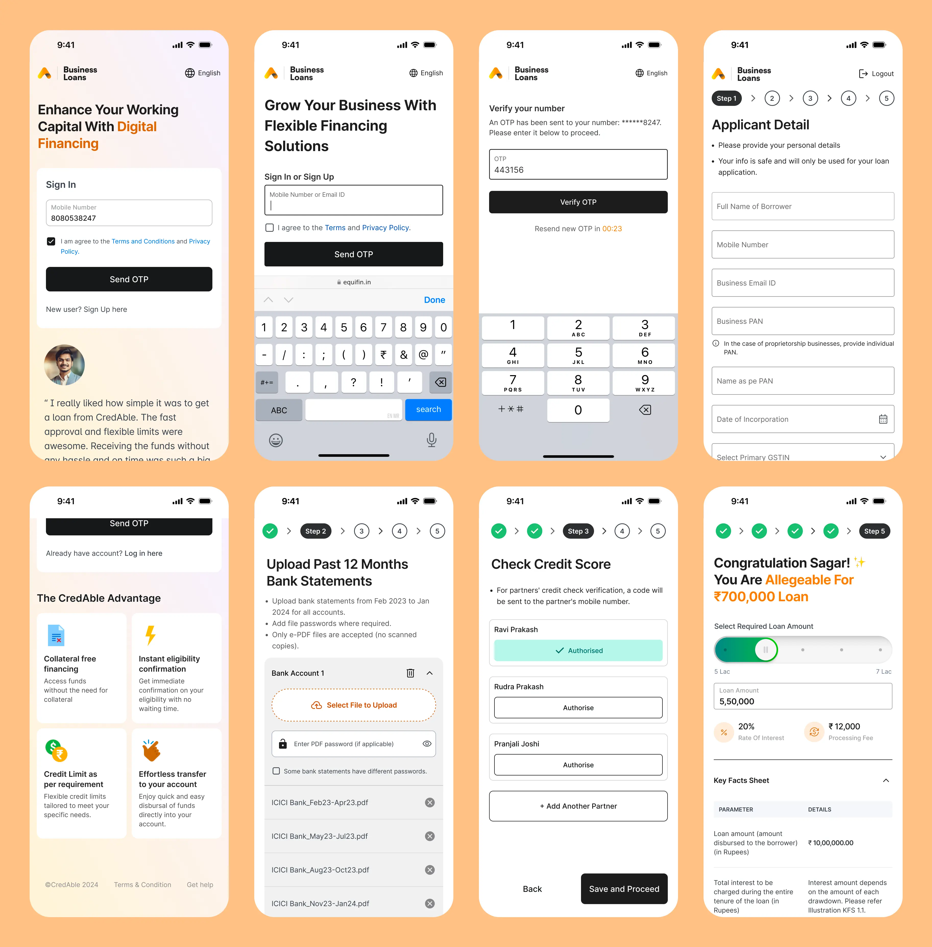
MOBILE EXPERIENCE
Mobile-First, Not Mobile-Also
Knowing our demographic, the entire layout was designed from scratch for mobile (WAP). I ensured tap targets were generous, sticky call-to-actions were always within thumb's reach, and complex elements like the GST previews scaled elegantly down to smaller viewports.
Knowing our demographic, the entire layout was designed from scratch for mobile (WAP). I ensured tap targets were generous, sticky call-to-actions were always within thumb's reach, and complex elements like the GST previews scaled elegantly down to smaller viewports.
Comfortable tap areas
Comfortable tap areas
Clear vertical flow
Clear vertical flow
Easy-to-reach primary actions
Easy-to-reach primary actions
Readable forms and guidance
Readable forms and guidance
One main task in focus
One main task in focus
IMPACT
The clearest verified improvement was the time borrowers needed to complete the onboarding journey.
The clearest verified improvement was the time borrowers needed to complete the onboarding journey.
BEFORE
~20-25 Minutes
Average completion time
Average completion time
AFTER
~12-15 Minues
Average completion time
Average completion time
The redesigned journey reduced the effort needed to understand and complete the process. I would only add completion-rate, GST-success, or support-ticket metrics here once those numbers are verified.
The redesigned journey reduced the effort needed to understand and complete the process. I would only add completion-rate, GST-success, or support-ticket metrics here once those numbers are verified.
REFLECTION
Simplifying a financial journey does not always mean removing steps.
We could not remove GST verification.
We could make it easier to understand.
We could not hide important financial information.
We could show it at the right time.
We could not design a different product for every partner.
We could create a structure that worked across brands.
We did not remove the complexity of applying for a loan. We made that complexity easier for borrowers to handle.
We did not remove the complexity of applying for a loan. We made that complexity easier for borrowers to handle.

