

Streamlining Loan Origination Using a Low-Code Platform
Client
CredAble
What we delivered
Enhanced UX & UI Design
Optimised User Flow
Responsive & White-Label Ready UI
Usability Enhancements
My Role
Wire-framing
Screen Flows
Visual Design
Interaction Design
Creative team
Pratik Joshi
Platform
Desktop platform
Mobile platform
BAAS
PROBLEM
Customising the LOS for each client was a manual and time-consuming effort. Every client needed a white-labeled experience tailored to their brand and workflows. This required extensive collaboration between designers, product managers, and developers. As a result, customising each journey took 4–8 weeks, significantly slowing down our go-to-market and limiting scalability.
GOAL
As the designer, my goal was to create a flexible, scalable UX that could adapt to different client needs without starting from scratch. We adopted a low-code approach to make the LOS modular and configurable, reducing setup time, enabling faster onboarding, and minimising tech dependency.
RESEARCH
By studying CloudBankIn and other similar products, we pinpointed specific aspects that could be enhanced in our LOS module. Our goal was to design a more intuitive and user-friendly interface that simplifies the customisation process and reduces the time required for each client’s unique white-label experience.
Simple User Interface:
CloudBankIn's UX was a bit complicated, so we decided to simplify things by cleaning up the clutter and improving navigation.
Better Customisation Tools:
Our goal was to offer more ways to customise to fit different client needs easily, without needing to do everything manually.
More Scalable:
We decided to use low-code solutions to fix the scalability problems we found in CloudBankIn's system, so we can deploy faster and handle many client projects at once more effectively.
Module Generator
At the start we have decided to create our own system to manage conditions for that I have crated a flow with forms. Below is the design concept I have come up with.

After discussing in 2nd rounds of meeting we decided to use 3rd party application to generate form sections.
Master Program Configuration
We added a Master Configuration feature for program settings to boost efficiency and flexibility. It can be used for all programs, saving time and ensuring consistency.
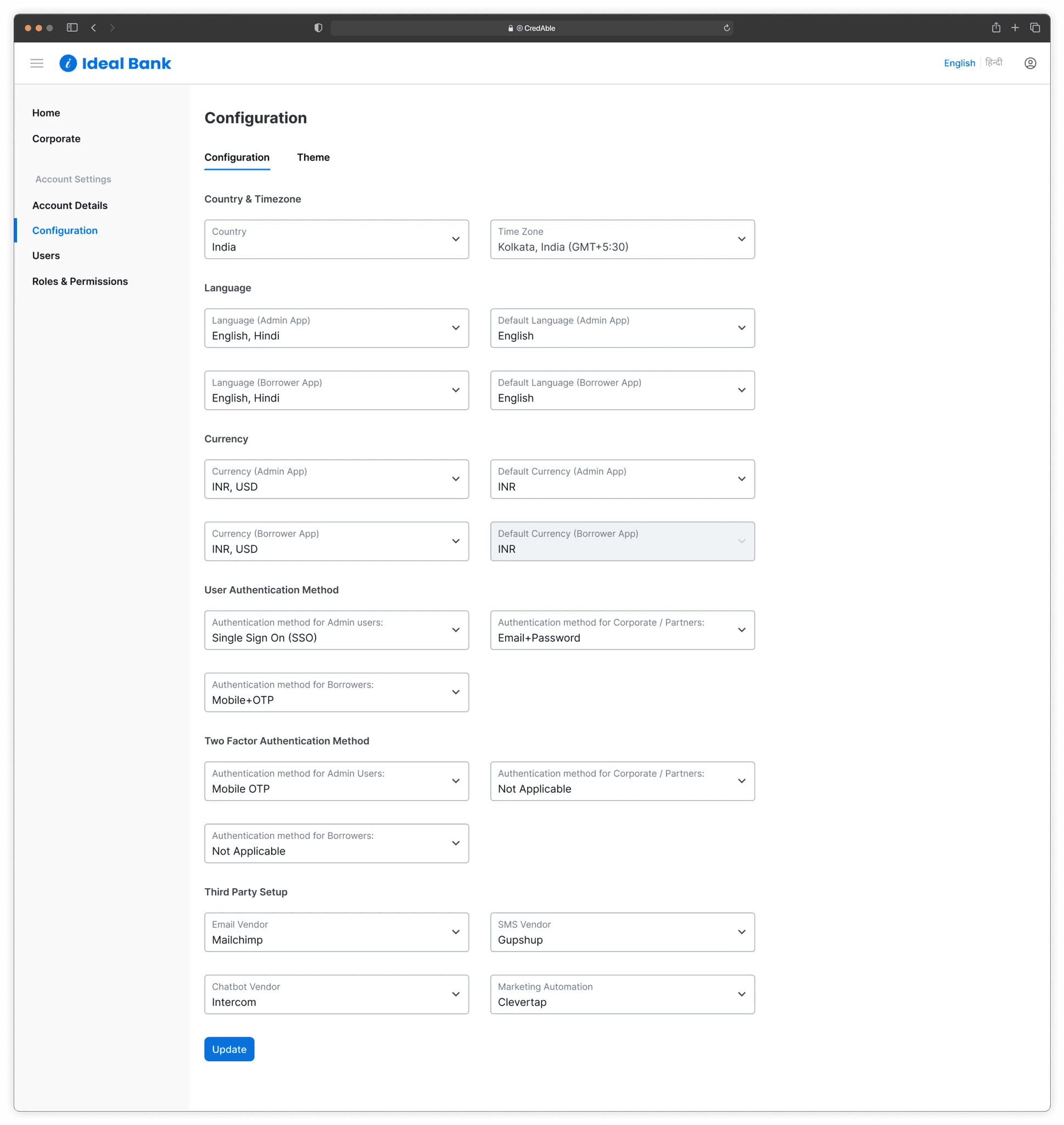
Program Management
For program management, we designed a dedicated page where users can efficiently manage all created programs. This page allows users to view detailed information, edit, or delete programs, streamlining the overall management process.

We made it easy for users to choose which columns to show and move them around. This helps them see the table just the way they like, making it faster and easier to use.

In Program Configuration
While making a program, users can change parts of it to fit their needs. This makes it easier to manage and works better for different situations.

3-A. Exploring Theme Settings – First Iteration
This was the initial version of the theme configuration I designed. While it turned out to be a bit complex for practical use, it helped us understand the constraints better and guided us toward a simpler, more effective solution.
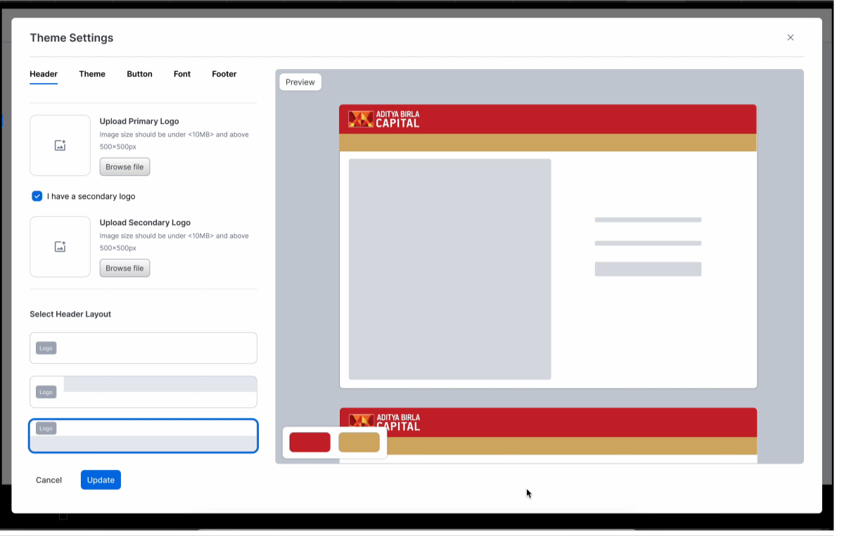
3-B. Theme Settings
A key challenge was defining a colour scheme that would work well across all products. To address this, I decided to leverage a single primary colour and its tonal variations as secondary and supporting colours. This approach simplified the white-labelling process and ensured consistency.

Auto Theme Toning
By selecting the primary colour, the entire platform automatically updates all associated tones and accents based on the new selection.


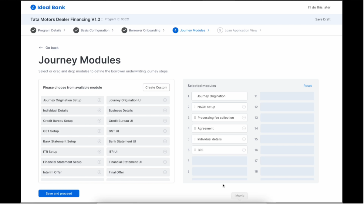
Program Modules Selection
While creating a new program, users need to select the right modules. To make this easier, we designed a section where they can quickly add or remove modules by clicking or using drag-and-drop.
There’s also an option to create new modules on the spot if needed.
Click & Drag: Lets users select or remove modules quickly, making the process smooth and intuitive.
Create New Modules: Gives users the flexibility to add custom modules as needed.
These features help speed up setup, reduce mental effort, and make the platform more flexible and user-friendly.
Types of Sign In / Signup – Use Case
In the LOS low-code project, we designed multiple sign-in/sign-up flows to suit different user roles and onboarding needs — like borrowers, internal teams, or partners.
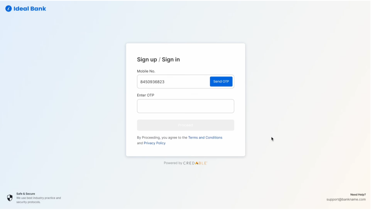
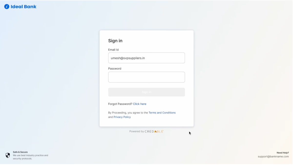

After discussing with the team, we decided to go with the center-aligned content layout. There were two main reasons for this:
1. Easier to adapt for different brands
Different brands use different visuals—some like illustrations, others use photos. If we use side-by-side layouts, we’ll need to adjust each time. Center-aligning content is easier and works better with any style.
2. Works better with future AI chatbot integration
We’re planning to add an AI chatbot later to help users and reduce the workload for Relationship Managers. Center-aligned content gives us a balanced layout that works well with chatbot features and doesn’t feel cluttered.
Other Projects
SaaS / Web Project
Simplified the loan journey for borrowers and helped the business reduce churn.
View Now
B2C - SaaS / Web Project
Simplifying Invoice Management on UpScale
View Now